How To – Make a nice map of the open web
by P
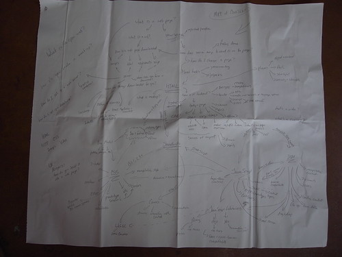
For the P2PU School of Webcraft we are working on a map of competencies that web developers need. Besides the soft skills we refer to as hacker’s habits, there is a whole range of technologies and practical skills. A few months ago I had the chance to hold a box of crayons for Chris Blizzard and Arun Ranganathan from Mozilla who came up with this original map of the open web.

While inspiring (and confusing) we needed something a little more electronic – so that others can edit/iterate on it, and we can refine it easily as we learn more about the competencies that our graduates want and how to map them against the courses we are offering.
Since I am interested in graphs and this is a problem I have encountered before, I spent a little time investigating our options (mostly by sending out questions to people smarter then myself and trying to understand their answers). I ruled out using a diagram editor that has no underlying logical representation of the graph – in other words, it’s not a graph, it’s a drawing of a graph – since drawings don’t evolve in sync with the underlying data. With that out of the way, there seemed to be two main alternatives:
- Use a Mindmap – There are a number of good open source projects that look suitable to the task. There doesn’t seem to be a standard file format yet and the easiest would have been to agree on one application and use its native file format. There are also some nice online mindmap tools that let you store the mindmap in the cloud so that a group of people can edit it and you don’t have to deal with versioning and sending files around.
- Use the .dot language to create the graph structure and a visualization tool to make it look pretty. This seemed the more compelling way to go, because we have more flexibility of the graph structure, it’s really simple to get started (but can get very complex if you want), and anyone can edit it using nothing but a simple text editor (there is only one editor of course, and that’s VIM :-))
The .dot file looks something like the following (click here to see the complete file):
graph G {
e [shape=ellipse, label="HTML", style=bold];

f [shape=ellipse, label="What is markup?"];

g [shape=ellipse, label="Basics of Layout"];

h [shape=ellipse, label="Document order vs. display order"];

e -- f;

e -- h;
....
While I was working on the graph structure, I used the excellent OSX implementation of Graphviz to check my work. The fact that Graphviz seems to be getting a new boost of input – I think the original author managed to move the project to AT&T – was another selling point for using this solution.
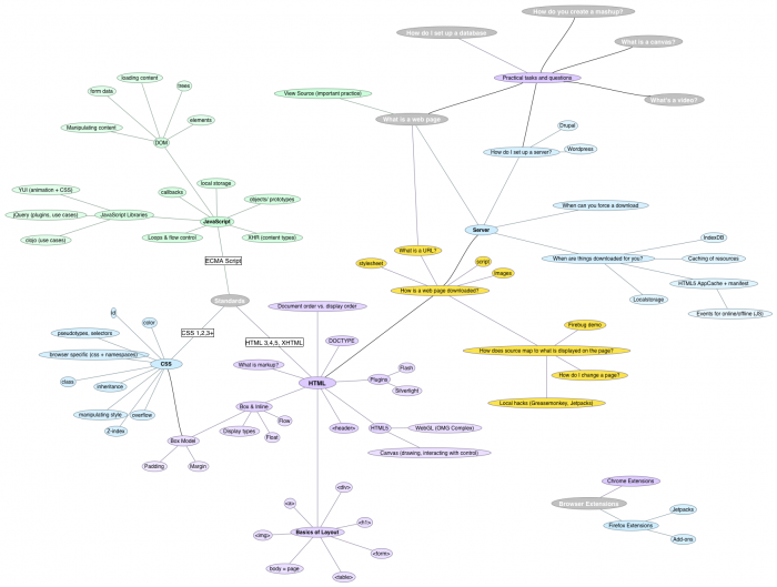
However, we also thought it made sense to have a slightly more polished (with colors!) version of the map that we could show to non geeks. I downloaded a trial version of OmniGraffle (and am very tempted to purchase a license) which let’s you open a .dot file and then manipulate the graph. Unfortunately, you can’t make changes and export them back as .dot, but I didn’t really need to do that anyway.
Here is the “pretty” version made with OmniGraffle:
If you need a text based graph structure, but also want nice looking graph visualizations – this might be a solution that works for you as well.
Update: The ultimate solution would be an import of our .dot file into this (thanks John!).

